The Shame Phone Has Spoken: Why Britain's Best Layouts Die at the Bus Stop
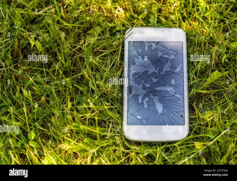
Photo: designer holding cracked smartphone outdoors in bright sunlight testing website, via c8.alamy.com
There is a moment every British designer knows. The client has signed off. The file is exported. The invoice is drafted. And then someone in the studio says the four words that have killed more beautiful layouts than any budget cut: "Right, let's go outside."
What happens next is not QA in any formal sense. It is a pilgrimage. A designer — usually the most junior, usually against their will — walks to the nearest bus stop, pulls out the studio's designated humiliation device, and squints at the work they spent three weeks perfecting. If the call-to-action survives a Manchester June (all four days of it), it survives anything.
Enter the Shame Phone
Every studio has one. It lives in a drawer, beneath the cables nobody dares to unplug, and it is usually the phone somebody's dad retired in 2016. Screen scratched. Battery held together with hope. Brightness slider that goes up to a number the manufacturer is legally not allowed to mention.
"We call it Doris," says Ellie Farrow, a designer at a Leeds branding studio. "She's got a crack that runs right through the middle of the screen. And honestly, she's the best creative director I've ever had. If a headline reads fine through that crack, it'll read fine anywhere."
The logic is brutally simple. Your office monitor is a £2,000 lie. It is colour-calibrated, glare-free, positioned at the precise angle recommended by someone with a doctorate in ergonomics. Your audience is not looking at your work on a £2,000 lie. They're looking at it on a phone with a fingerprint smudge over the logo, held at arm's length while walking a dog in drizzle.
The Bus-Stop Mandate
Some agencies have formalised the ritual entirely. One Bristol studio we spoke to — whose founders asked not to be named, presumably because their clients would be horrified — has a written policy: no web layout ships until it has been viewed outdoors, on at least two devices, one of which must be "objectively rubbish."
"We call it the bus-stop test," says one of the founders. "There's a stop on the way to the sandwich shop that gets full afternoon sun. It's become our external review room. We've had three team members nearly miss actual buses because a button wasn't reading."
The practice is catching on in ways that formal accessibility audits never quite managed. There's something about standing in the drizzle, one eye on the traffic, that reveals truths no PDF annotation ever could. Contrast ratios are abstract. "I can't read the tagline and a number 36 is coming" is not.
Why the Glossy Monitor Is a Lie We Tell Clients
Here is the uncomfortable truth at the heart of all this: the client presentation is theatre, and everyone knows it. The 5K screen in the meeting room, the mockups at pixel-perfect scale, the gentle ambient lighting — it's a stage production. The audience applauds. Then they go back to their office and open the work on a laptop balanced on a windowsill, and the beautiful hero image becomes a reflective void.
"I stopped designing for the presentation years ago," Farrow says. "I design for the worst moment. The worst screen, the worst light, the worst mood. If it works then, everything else is a bonus."
There's a certain national character to this, of course. Other countries test their designs in ideal conditions. Britain tests them in the conditions it actually has: overcast, glary, intermittently raining, viewed through a rain-spattered bus shelter while a seagull judges you. Our environment is the ultimate stress test, and honestly, it's free.
A Ritual, Not a Rulebook
Nobody is arguing that Doris should replace proper accessibility tooling. Contrast checkers, screen readers, responsive breakpoints — all still vital. But there's a humility in the shame phone that software can't replicate. It's a reminder that the audience for your meticulously kerned masterpiece is a person on a lunch break, at an awkward angle, with about four seconds of patience.
So if you visit a design studio and see a junior member of staff standing at the window, holding a battered handset up to the light like they're inspecting a gemstone — don't worry. That's not a breakdown. That's quality assurance, British style.
And if the layout survives Doris? Then, and only then, it ships.